The 30-year high in US measles cases, in one chart

BIAS: Center
RELIABILITY: High

Political Bias Rating

This rating indicates the source’s editorial stance on the political spectrum, based on analysis from Media Bias/Fact Check, AllSides, and Ad Fontes Media.

Far Left / Left: Progressive editorial perspective
Lean Left: Slightly progressive tendency
Center: Balanced, minimal editorial slant
Lean Right: Slightly conservative tendency
Right / Far Right: Conservative editorial perspective

Current source: Center. Stories with cross-spectrum coverage receive elevated prominence.

Reliability Rating

This rating measures the source’s factual accuracy, sourcing quality, and journalistic standards based on third-party fact-checking assessments.

Very High: Exceptional accuracy, rigorous sourcing
High: Strong factual reporting, minor issues rare
Mixed: Generally accurate but occasional concerns
Low: Frequent errors or misleading content
Very Low: Unreliable, significant factual issues

Current source: High. Higher reliability sources receive elevated weighting in story prioritization.

Axios
09:45Z

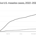
Data: CDC ; Chart: Axios Visuals This chart shows what it looks like to hit a 30-year high in measles cases — and why the U.S. is on track to lose its measles “elimination status.” Why it matters: We’ve all heard that cases are on the rise, but the reality is that they’re skyrocketing. It started with an outbreak in West Texas , and now infections are reported in nine states and hundreds are in quarantine due to a major surge in South Carolina.

More than out of 10 cases were among unvaccinated people or those with unknown vaccination status, per the Centers for Disease Control and Prevention. What they’re saying: On Tuesday, Ralph Abraham, a top CDC official, told reporters that the end of the measles elimination status in the U.S. would be “just the cost of doing business, with our border

Continue reading at the original source

Read Full Article at Axios →